

Soft Autumn Blues: How to Style The Color Family
November 6, 2025
Light Spring vs Soft Summer: How to Tell Them Apart
November 11, 2025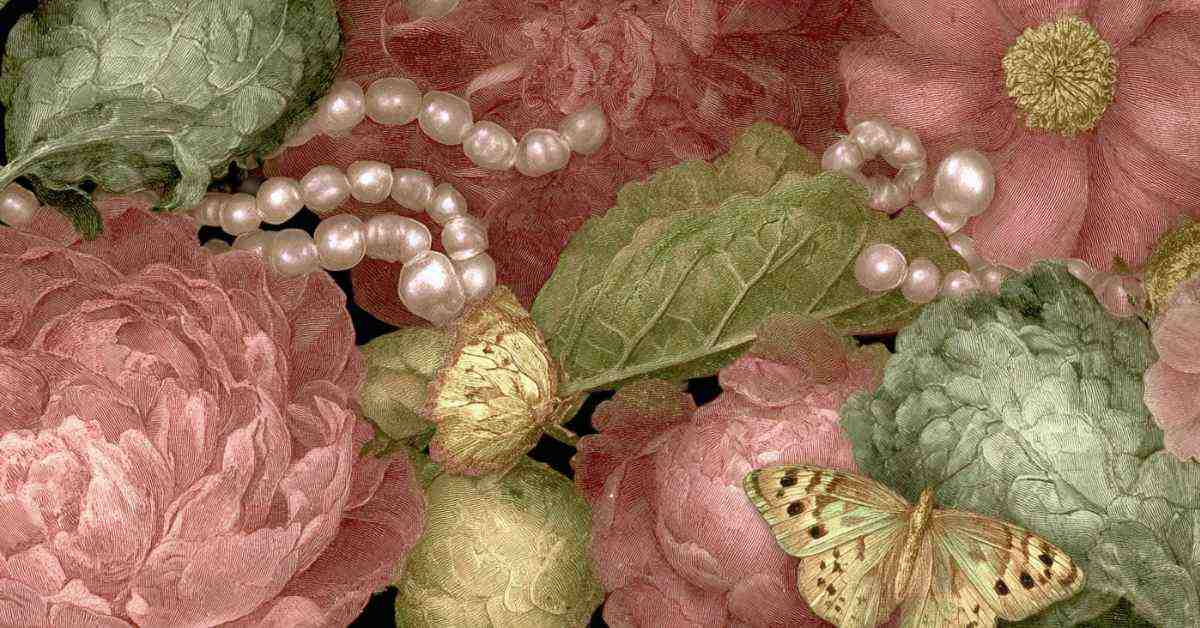
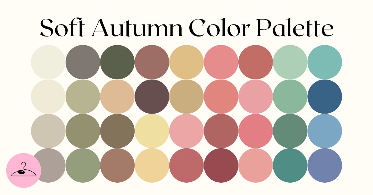
The Soft Autumn color palette stands as the most muted of the Autumn family. If you belong to this palette, your best colors are gentle, earthy, and blended: that is, never too sharp, too bright, or too dark. In this guide, we’ll walk you through this palette, so that you can build a timeless and harmonious wardrobe, tailored to your complexion. Without further ado, let’s dive in!
The Color Dimensions of the Soft Autumn Palette
Soft Autumn lives in the “in-between.” Its best colors aren’t icy or sharp like Winter, yet they’re not vivid like Spring either. Instead, they look as if a little warm sunlight and a touch of shadow have softened them. Imagine pulling a filter over brighter shades: what’s left is gentler, easier on the eyes, and always in balance.
The season is best described as warm-neutral, medium, and muted. Warm-neutral means the tones lean cozy, with golden undertones, but never too orangey. Medium value means nothing goes to extremes. That is, no super-pale pastels, no deep, dark shades. And muted (low chroma) means colors appear softened or blended, more like a watercolor wash than a neon sign.
- Temperature: Warm-neutral
- Value: Medium
- Chroma: Muted, soft, never bright
PRO Tip: Play into Soft Autumn’s flexibility. Mix in softer Summer-like shades when you want a lighter look, and lean on Autumn’s warmth for extra depth and coziness.
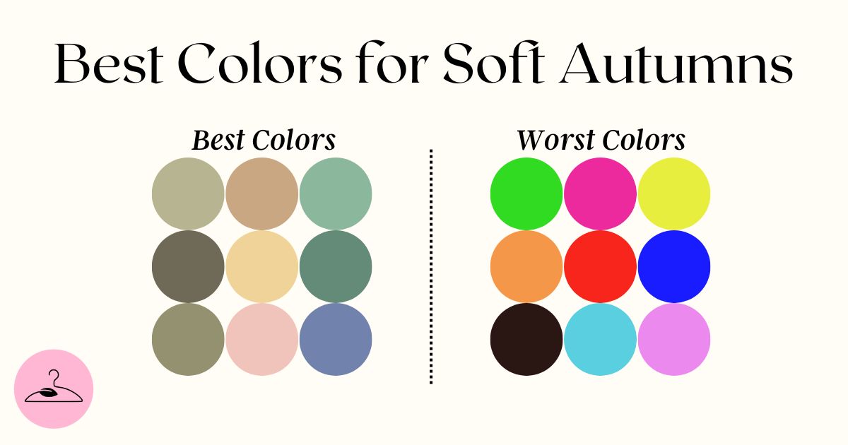
Best vs Worst Shades for Soft Autumns
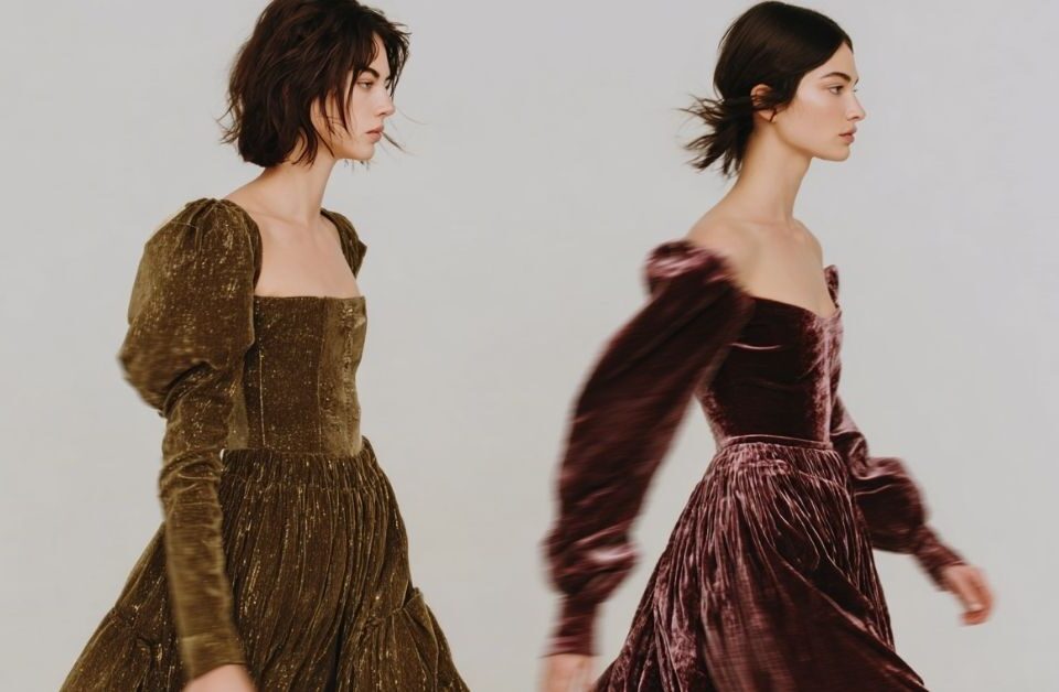
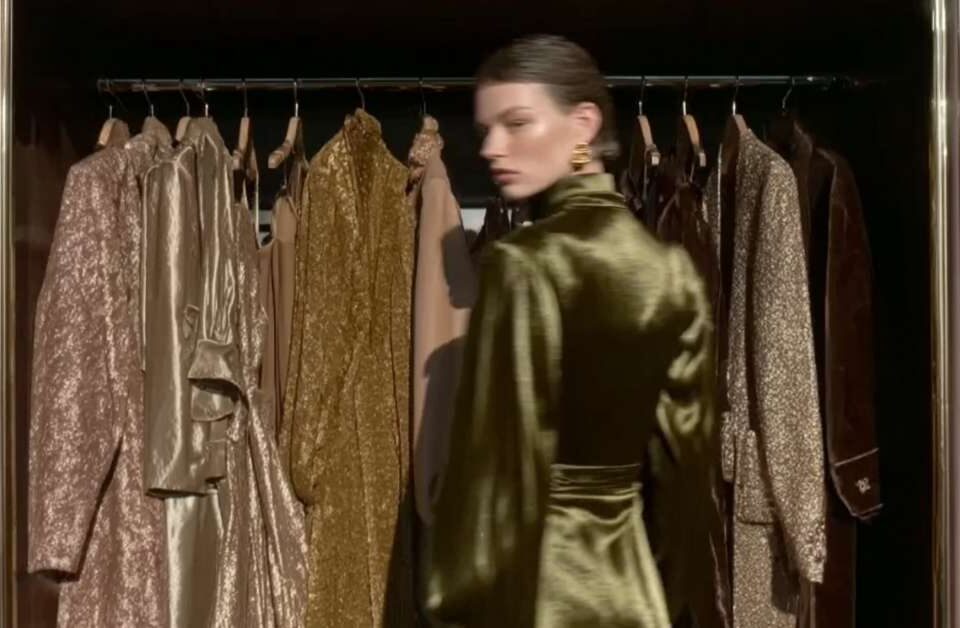
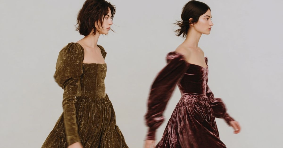
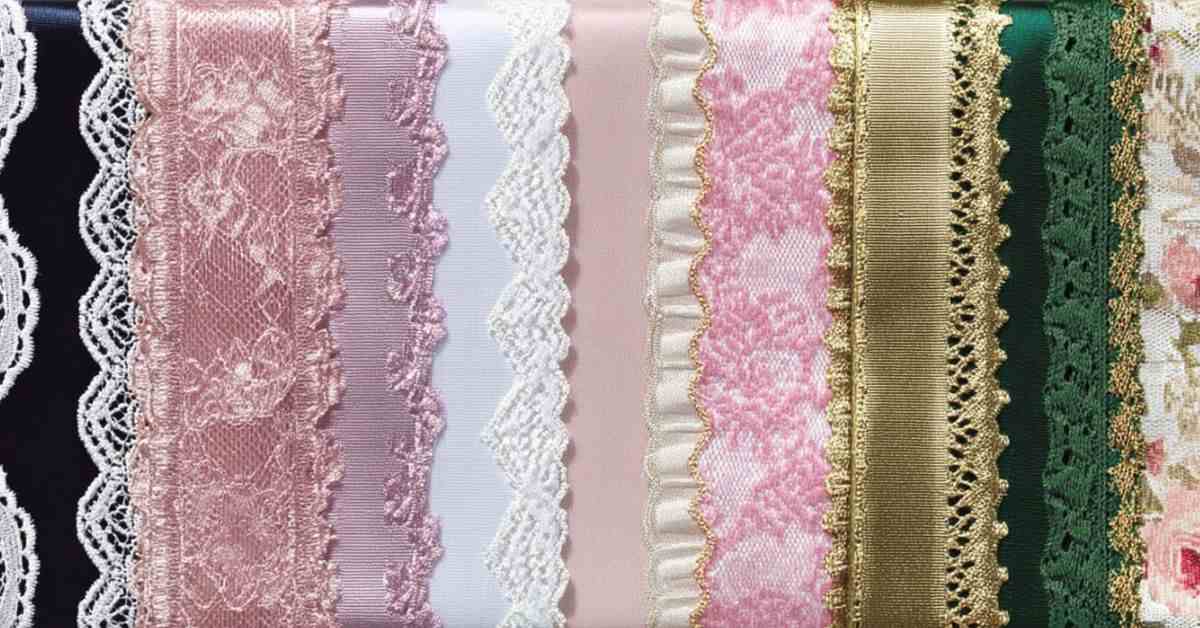
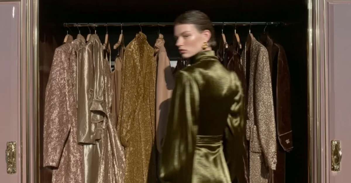
Soft Autumns look their best in shades like dusty teal, moss green, sage, salmon, terracotta pink, muted gold, camel, soft plum, and taupe. These colors reflect the palette’s gentle warmth without taking over.
On the flip side, the Soft Autumn worst colors to wear include bright jewel tones (emerald, fuchsia), icy pastels, and stark black-and-white. These shades are either too cool or too high-contrast, which can overpower your natural softness and mute your glow.
PRO Tip: If a color feels loud or “wears you,” it’s likely not Soft Autumn. If it feels cozy, balanced, and subtle, it’s probably a match.
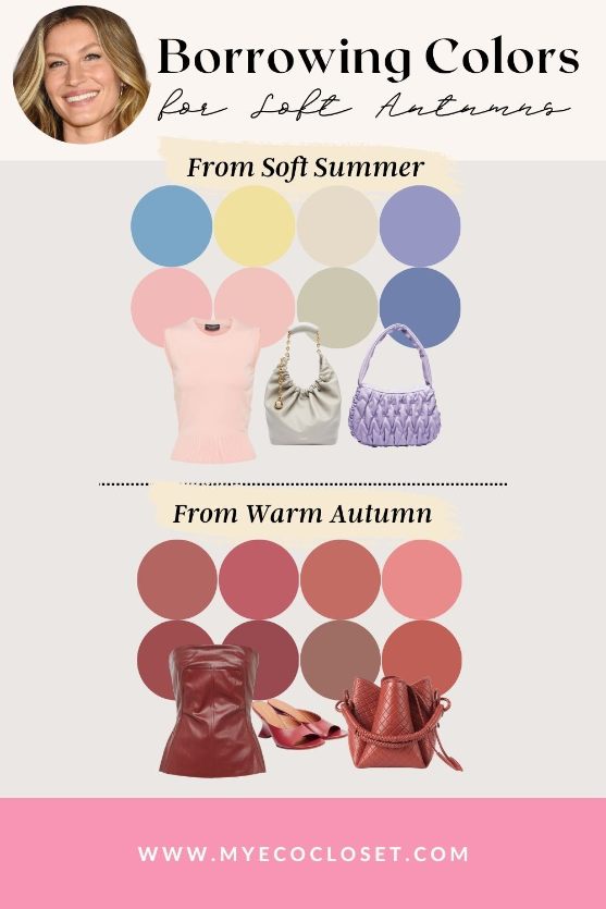
Borrowing from Neighboring Palettes
Soft Autumn shares borders with Soft Summer and Warm Autumn, which means you can sometimes borrow from those palettes, but only with care.
From Soft Summer:
Some of Soft Summer’s muted shades, especially the softer berries, mauves, and misty greens, can blend well with Soft Autumn’s palette as well. The key is to choose colors that lean slightly warm or neutral. If a color feels too cool, like icy lavender or powder blue, it will clash.
From True Autumn:
You can borrow earthy True Autumn tones with extra warmth, such as golden camel, rich terracotta, or a warm olive green, provided they’re not too strong. More saturated or fiery shades (like bright pumpkin orange), however, may overwhelm Soft Autumn’s gentler look, so use them sparingly as accents.
PRO Tip: If the borrowed color still feels cozy, muted, and in balance with your features, it’s a safe addition. If it looks loud, harsh, or makes your skin appear shadowed, it likely belongs outside your palette.
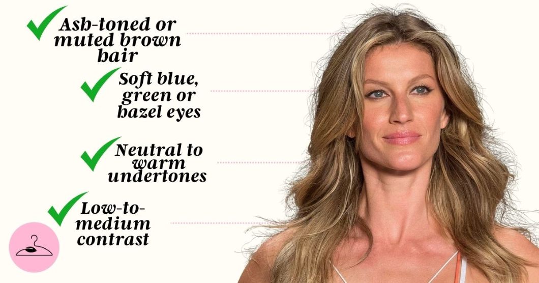
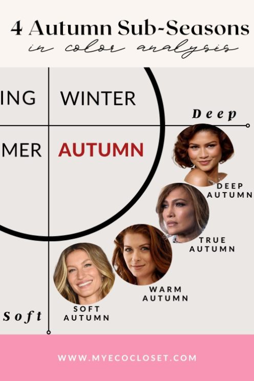
What Classifies Someone As a Soft Autumn?
To reiterate, Soft Autumn falls within the Autumn family. However, it has lower contrast and softer saturation than True or Deep Autumn. This means that a Soft Autumn individual’s features blend gently rather than possessing a stark contrast. Key Soft Autumn color traits include:
- Undertone: Warm-neutral with a muted golden softness
- Hair: Ashy or muted browns with golden undertones, sometimes soft auburn
- Eyes: Green, hazel, or soft brown with a misty quality
- Skin: Warm beige, ivory, or olive with a golden glow that looks best in muted warmth (not sharp brights or icy tones)
Styling The Core Soft Autumn Palette Colors
The beauty of the Soft Autumn palette lies in how subtle warmth and muted tones create harmony when styled together. Instead of high-contrast pairings, think gentle blending and layered neutrals with earthy accents.
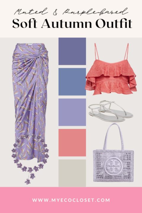
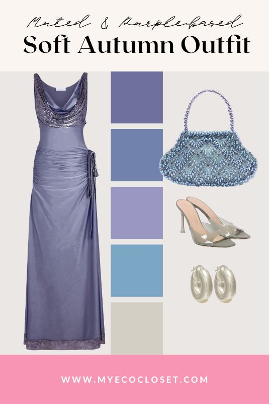
Purples
Soft Autumn purples, like muted mauve and gentle plum, add depth without overpowering your look. A dusty plum blouse with camel trousers works well for office wear, while a soft mauve scarf against olive outerwear feels elegant for everyday styling.
PRO Tip: Avoid bright violets or bluish lavenders, which belong to cool seasons and disrupt the muted warmth Soft Autumn requires.
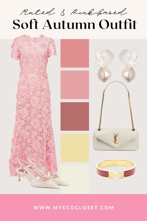
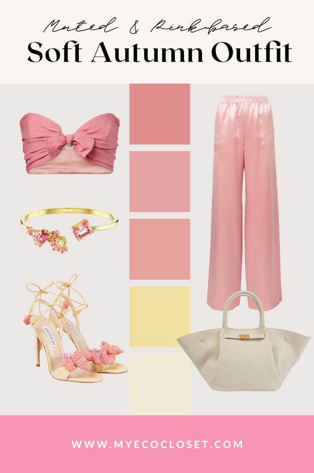
Pinks
The best Soft Autumn pinks lean warm and natural: think salmon, rose, or terracotta pink. A muted pink dress with antique gold jewelry creates a balanced, romantic effect, while bright bubblegum or neon pinks disrupt your natural harmony.
PRO Tip: Stay away from bubblegum or neon pinks, as these are too cool or bright, making Soft Autumn skin look sallow rather than glowing.
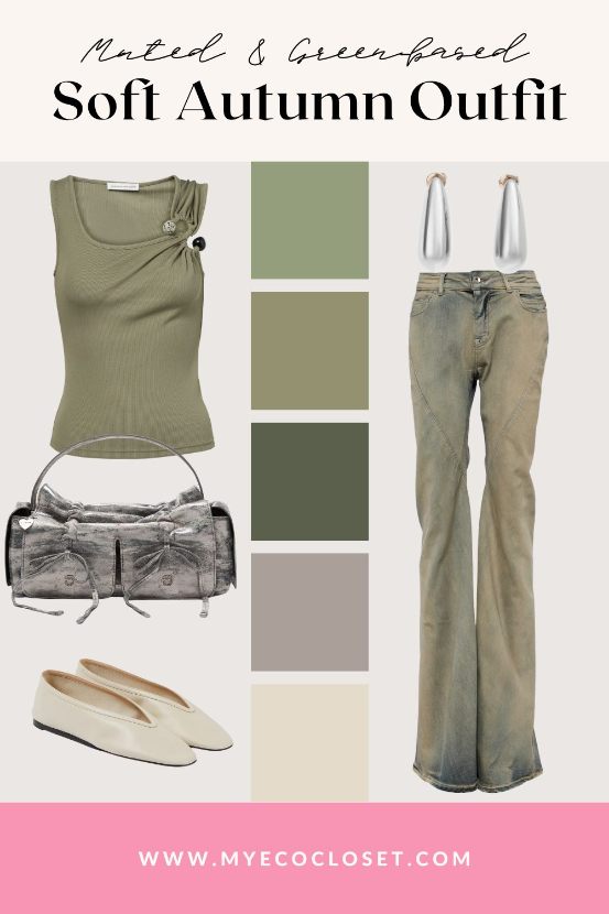
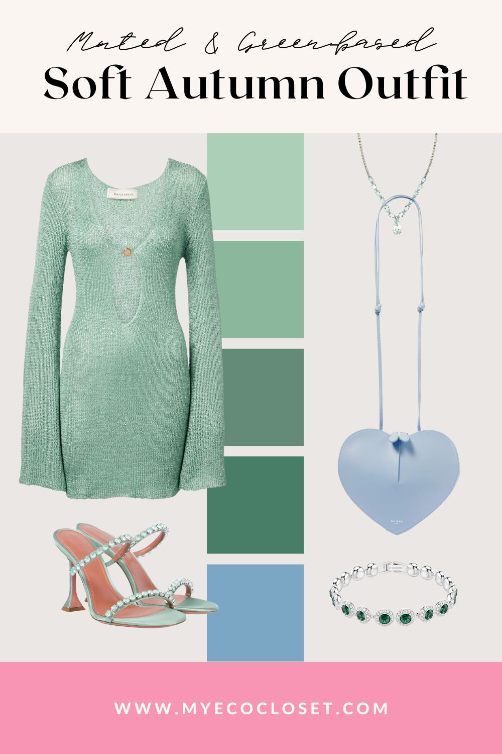
Greens
Muted Soft Autumn greens are a cornerstone of the wardrobe. Sage, moss, and muted teal flatter your coloring beautifully. Try layering a moss green cardigan over taupe basics for casual days, or wear a teal dress with bronze accessories for evening elegance.
PRO Tip: Cool, icy, or saturated emerald greens are best avoided, as they read too sharp and belong to Winter palettes.
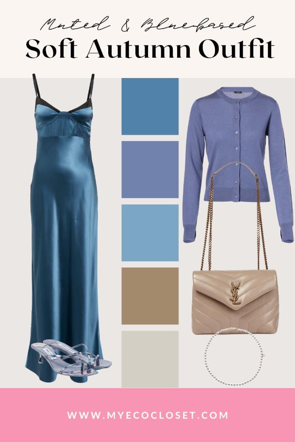
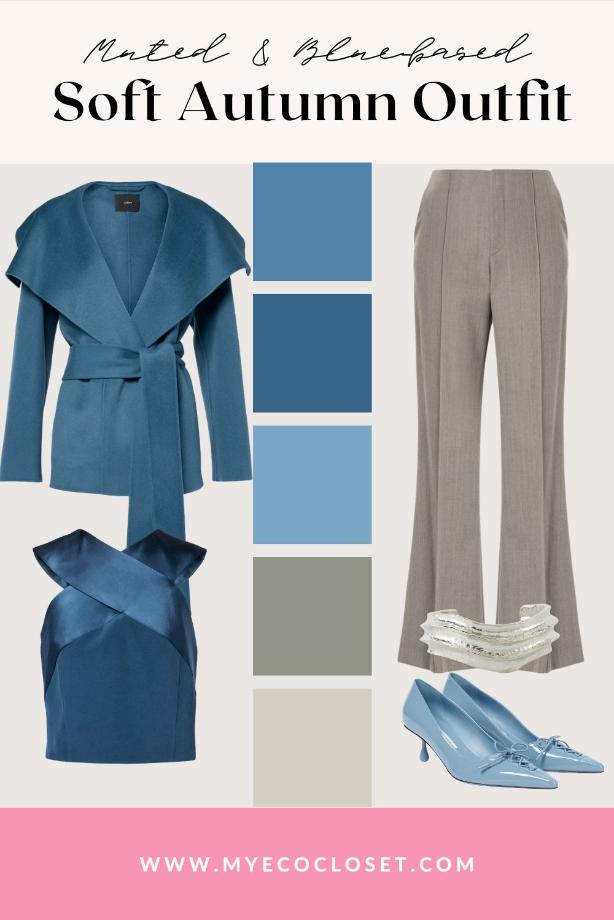
Blues
Similarly, the ideal Soft Autumn blue shades are never icy or vivid. They lean toward teal, dusty turquoise, and muted slate. A muted blue satin dress with pewter sandals and a taupe bag feels elegant, while a periwinkle cardigan over neutrals is easy for day. For an officewear look, try a dusty blue wrap coat with warm gray trousers.
PRO Tip: Skip bright cobalt or powdery ice blues, which belong to Winter and Summer palettes and can make Soft Autumn skin appear dull rather than radiant.
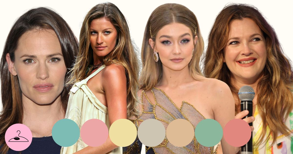
Soft Autumn Celebrities to Follow
Several Soft Autumn celebrities illustrate the palette in real life. Gisele Bündchen embodies it with sunlit skin and hazel eyes in muted contrast. Lana Del Rey carries the palette’s inherent muted warmth, as her brown hair and hazel-green eyes blend with ease.
Similarly, Jessica Biel possesses brown hair and gentle eyes. This brings her in harmony with the Soft Autumn palette. Gigi Hadid is also another ambassador of the palette, with her golden blonde hair and a softened overall glow.
PRO Tip: When looking for inspiration, study how these celebrities shine in muted, earthy tones rather than bold brights. Their best looks often come from balance—colors that support, rather than steal, the spotlight.
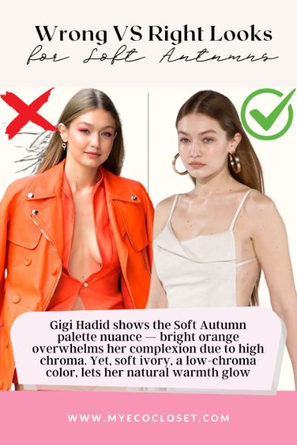
Wrong vs Right Celebrity Looks for Soft Autumns
Color analysis may be a trusted styling system, but even celebrities sometimes step outside their best palette. Two Soft Autumn icons show how the wrong shade can overwhelm while the right one can bring harmony.
Gigi Hadid
❌ Wrong look: In a bright orange dress, the intensity of the shade overshadows Gigi’s natural warmth. The high chroma competes with her soft golden undertones, making the outfit louder than her presence.
✅ Right look: When she wears soft ivory, the difference is striking. The low-chroma, warm-neutral shade brings balance to her features and allows her golden tones to shine.
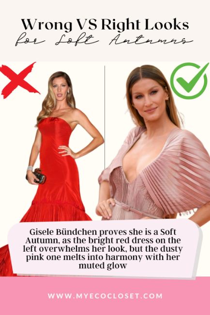
Gisele Bündchen
❌ Wrong look: A bold, saturated red dress pulls attention away from Gisele’s inherent mutedness. The shade is too vivid, flattening her complexion and masking the softness in her eyes and hair.
✅ Right look: In a dusty pink dress, you can immediately notice the harmony. The muted warmth blends into Gisele’s natural, Soft Autumn coloring.
Final Thoughts
The Soft Autumn palette exudes gentle harmony, with colors that feel blended, balanced, and quietly radiant. To echo this palette in your wardrobe, choose earthy tones with softened edges. Remember: if a shade feels cozy and in tune with your natural coloring, it’s likely a keeper.
✨Ready for more inspiration? Explore our Soft Autumn Pinterest board for curated outfit ideas, color pairings, and seasonal styling that bring this palette to life.
Frequently Asked Questions
Black is usually too stark for Soft Autumns because it creates a sharp contrast that overpowers their natural softness. Instead, deeper alternatives like espresso brown, soft navy, or deep charcoal provide grounding while keeping the overall look harmonious. These warmer, muted shades blend better with Soft Autumn’s golden undertones.
Soft Autumns glow in metals with warmth and subtlety. Antique gold, bronze, or brushed copper enhance golden undertones without looking harsh. Matte or lightly aged finishes are best, as shiny silver or platinum often feel too icy. Choosing soft, warm metals ensures jewelry integrates seamlessly with the muted palette.
Yes. Because Soft Autumn falls between Summer and Autumn, it can borrow softly muted shades from both palettes. For example, dusty rose from Summer or terracotta from Autumn blends well. The key is keeping colors warm-neutral and muted, avoiding bright Spring vivids or Winter’s icy tones.
Camel, taupe, muted olive, and warm gray are excellent neutrals for Soft Autumn. These hues create a balanced foundation for styling without overpowering. Pairing them with accent colors like soft teal or terracotta adds variety. Unlike stark black or white, these neutrals maintain softness and a cohesive, natural flow.
Soft Autumn makeup works best in warm, muted tones. Think salmon lipsticks, terracotta blushes, and golden-brown eyeshadows. These enhance skin’s golden glow without adding harsh contrast. Icy pinks or blue-based reds often clash, making skin appear dull. Earthy, softened hues instead highlight the gentle harmony of the Soft Autumn palette.
Soft Autumns look best in blended, low-contrast prints that reflect their muted palette. Watercolor florals, blurred geometrics, or softly mottled designs work beautifully. High-contrast patterns, like black-and-white stripes, feel overwhelming. Choosing diffused, earthy motifs ensures patterns complement rather than compete, helping outfits stay true to Soft Autumn’s natural softness.
Pure white is often too crisp and creates excess contrast. Instead, Soft Autumns should lean toward creamy off-whites like ivory, ecru, or warm beige. These shades echo the palette’s golden undertones and prevent starkness. Worn near the face, warm whites highlight natural softness and flatter more than pure white.
Soft Autumn is more muted and subtle, while True Autumn thrives in rich, earthy depth. A True Autumn may shine in mustard or rust, but these colors overwhelm Soft Autumns, who glow in sage, dusty teal, and terracotta. Soft Autumn feels lower contrast, with blended, watercolor-like tones.