

True Autumn Makeup: What Really Makes You Glow
September 12, 2025
Warm Spring vs True Spring: How to Tell Them Apart
September 22, 2025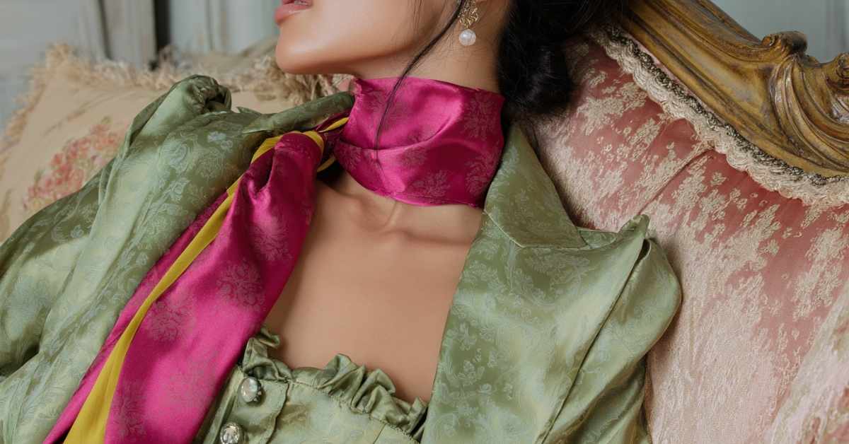
As a Soft Autumn, you shine in earthy, muted shades that feel like a golden October afternoon. However, certain colors can compete with your palette instead of enhancing it. In this guide, we’ll uncover the worst colors for Soft Autumn, and the easy swaps that keep your look harmonious. Without further ado, let’s dive right in.
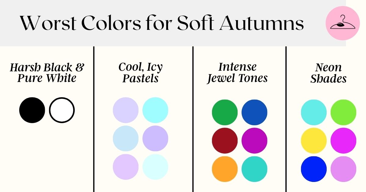
Worst Colors for Soft Autumn: Icy, Neon, and Harsh Contrasts
Soft Autumn thrives in muted, blended tones. Anything too sharp, cool, or overpowering works against your neutral-warm, low-contrast Soft Autumn color palette. Here are the shades that miss the mark:
1. Cool, Icy Shades
Think icy baby blue, frosty pink, or lavender-gray. These crisp Winter tones cancel out your golden undertones, draining the warmth from your skin and leaving it pale.
2. Overly Bright & Neon Tones
Hot pink, electric blue, and neon red are far too intense. These loud colors create a jarring contrast that overwhelms your muted palette. Instead of enhancing your softness, they shout over it.
3. Harsh Black & Pure White
Soft Autumns fade in stark black and blinding white. The sharp contrast erases your gentle coloring and looks severe. Creams, ivories, and soft olives are far more flattering.
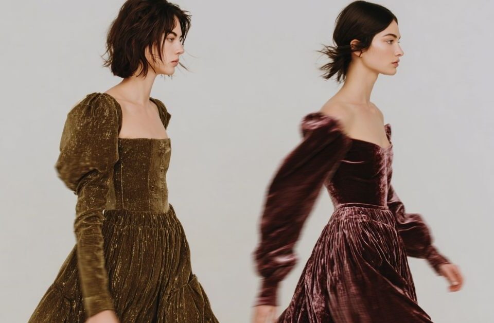
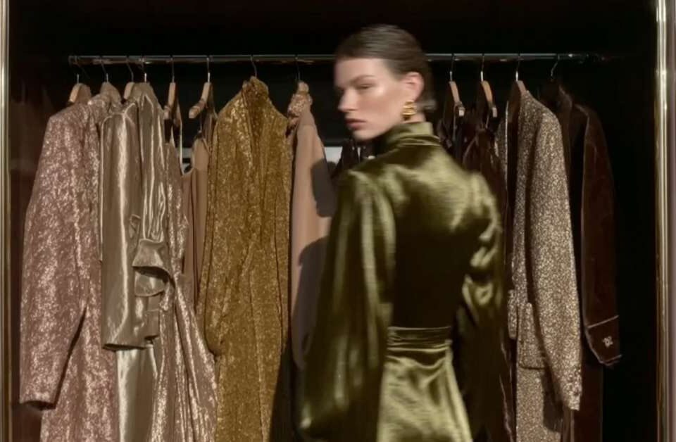
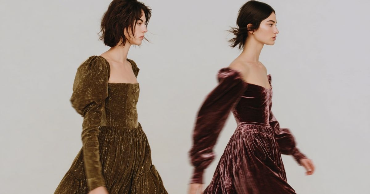
4. Intense Jewel Tones
Emerald, sapphire, and royal purple sparkle on Winters but drown out Soft Autumn’s subtle glow. They add weight where you need softness, like showing up to a casual brunch in a ballgown.
Why These Colors Don’t Work for Soft Autumns
The science behind color analysis makes it clear why these shades don’t work. Specifically, there are 3 discrepancies between Soft Autumn’s native palette and the aforementioned color families:
- Saturation Issues: Neon and jewel tones crank up the intensity far beyond your muted palette, overwhelming your natural warmth.
- Color Temperature Mismatch: Soft Autumn has warm undertones. Cool shades like icy blue are instant clashes, making skin look dull rather than radiant.
- Contrast Imbalance: Your coloring is blended and soft. High-contrast combos like black-and-white fight against this harmony.


Better Alternatives for Your Soft Autumn Wardrobe
Ready for the good news? For every problem color, there’s a gorgeous, soft autumn-friendly alternative that’ll make you look amazing. These swaps will transform your wardrobe from color-clash central to perfect harmony:
- ❌ Icy Blue → ✅ Sage Green or Dusty Teal
- ❌ Harsh Black → ✅ Chocolate Brown, Warm Grey, or Deep Olive
- ❌ Pure White → ✅ Cream, Ivory, or Warm Off-White
- ❌ Jewel Reds → ✅ Rust, Soft Coral, or Terracotta
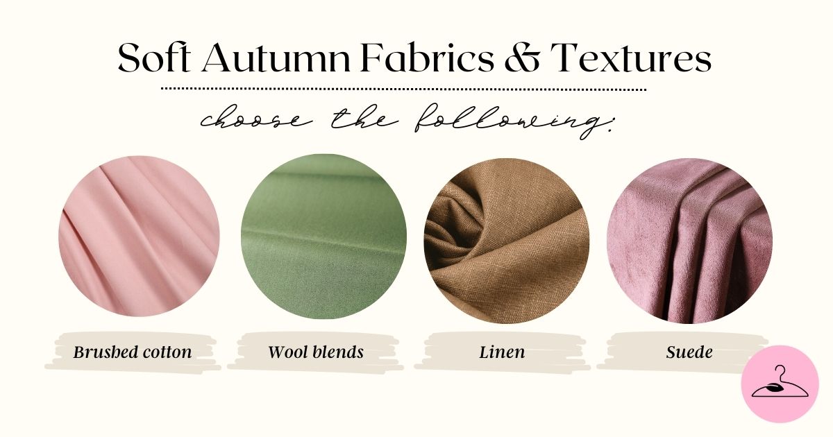
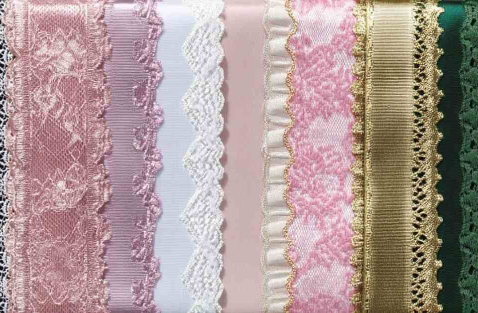
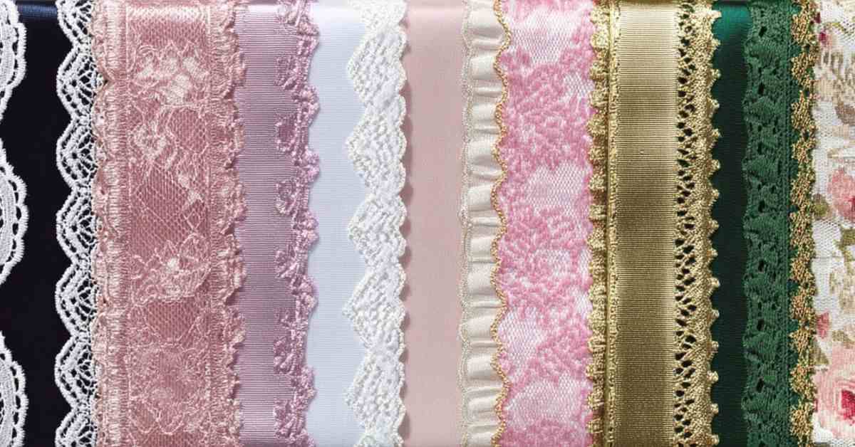
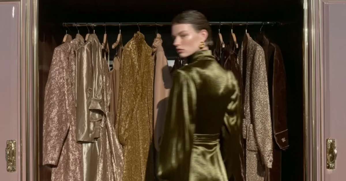
Beyond Color: Fabrics, Textures, and Accessories
For Soft Autumns, the story doesn’t end with which colors to wear. It continues with how those colors appear in fabric and accessories. A shade can be perfect in theory, but the wrong texture or finish can still work against your natural softness.
- Skip: high-shine satin, harsh crisp fabrics, and stark white gold jewelry.
- Choose: brushed cotton, suede, soft knits, matte finishes, and warm metals like gold, bronze, or copper.
And here’s the bonus: natural fabrics like cotton, linen, and wool aren’t just visually harmonious — they’re also healthier and more sustainable. Synthetics, on the other hand, come with a hidden cost. At My Eco Closet, we strive to raise awareness about this often-overlooked issue.
⚠️ The truth is, toxic fabrics like polyester, acrylic, and nylon are derived from petroleum and treated with harsh chemicals. These irritate the skin and expose it to potential carcinogens. Beyond personal health, they shed microplastics every time they’re washed, polluting our waterways and entering the food chain. With that, we urge you to boycott toxic fabrics and fast fashion in order to safeguard your health.


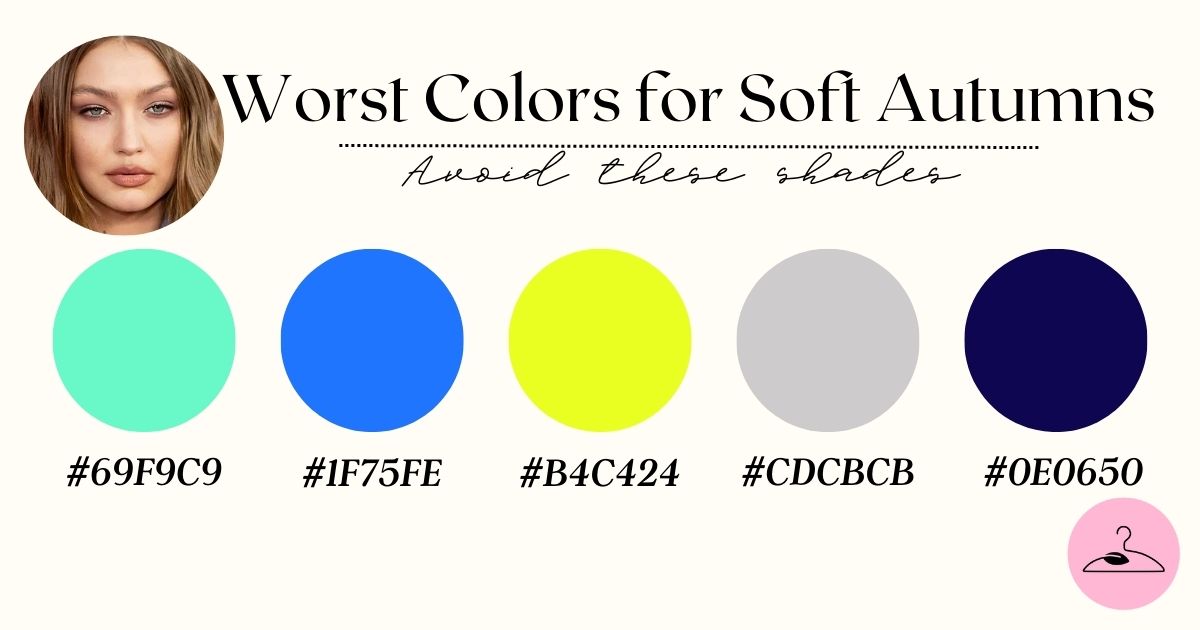
Celebrities in Soft Autumn Worst Colors
Seeing Soft Autumn colors in action helps bring the palette to life. Celebrities with similar coloring often give us visual proof of what works — and what doesn’t. Some well-known Soft Autumns include Jennifer Aniston, Jessica Alba, Chrissy Teigen, and Evangeline Lilly.
What’s most striking across these examples is the pattern: when these celebrities wear Soft Autumn’s muted, earthy palette, their features look naturally illuminated. Their skin appears smoother, eyes brighter, and overall presence more cohesive. But when they step into icy pastels, high-contrast black-and-white, or overly bright jewel tones, the clothes tend to “wear them” rather than the other way around.
Final Thoughts
Now that we’ve covered all the worst colors for Soft Autumn, it’s time to own your palette! To recap, Soft Autumn style shines when you embrace warmth, softness, and harmony. By skipping icy tones, neon brights, and stark contrasts, and leaning into muted, earthy shades and gentle textures, you’ll highlight your natural glow with ease.
✨ For more ideas, we’ve curated a Pinterest board full of Soft Autumn inspiration —follow along to keep your wardrobe in perfect harmony.
Frequently Asked Questions
Icy shades like baby blue, frosty pink, or lavender-gray come from the Winter palette. Their cool undertones clash with Soft Autumn’s natural warmth, muting the glow of your skin. Instead of brightening, they leave the complexion pale and lifeless, draining overall harmony.
Pure black is too harsh for Soft Autumns, but it can be softened. Pairing black with warm accessories like camel, ivory, or gold helps reduce contrast. Even better, replace black with deep olive, chocolate brown, or warm gray for elegance without losing natural warmth.
Jewel tones like emerald or sapphire overpower Soft Autumn’s muted softness. However, toned-down versions — such as dusty teal or softened moss green — can echo that richness without clashing. Think of them as “autumn-filtered” jewels that blend rather than dominate.
Neon shades ramp up saturation to a level that Soft Autumn coloring can’t balance. Instead of enhancing features, they compete for attention. A muted coral or terracotta provides the same vibrancy in harmony with warm undertones.
Bright white creates extreme contrast that feels disconnected from Soft Autumn’s gentle coloring. The alternative — ivory, cream, or soft off-whites — achieves the same crispness while echoing natural warmth, keeping the overall look soft and cohesive.
Yes. Dyeing hair icy platinum or jet black can overwhelm Soft Autumn’s natural warmth. Instead, warmer muted tones like honey brown, golden chestnut, or soft auburn create harmony, while overly extreme shades throw off balance and appear harsh against your skin.
Soft Autumn coloring is naturally blended, so harsh contrasts like black-and-white stripes or neon pairings look disconnected. They break the soft flow of your palette, making features seem fragmented. Choosing low-contrast combinations in warm, muted tones maintains harmony and highlights your natural warmth instead of fighting it.