

Synthetic Fabrics List: 15 Materials to Avoid
April 7, 2024
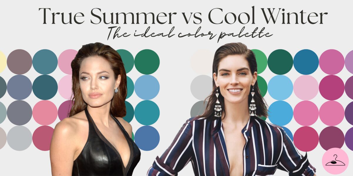
Cool Winter Vs Soft Summer: How to Tell Them Apart
April 16, 2024
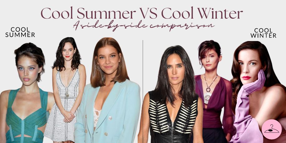
When it comes to the cool color seasons, there are two key categories that may look similar – Cool Winter and Cool Summer. These two sisters may share a cool undertone, but they are vastly different when it comes to their personal contrast level, saturation, and overall look. In this guide, we’ll take a closer look at the key distinctions between cool winter vs cool summer.
Cool Winter vs Cool Summer at a Glance
| Aspect | Cool Winter | Cool Summer |
|---|---|---|
| Value | Deeper, darker | Lighter, medium-light |
| Chroma | Bright, saturated | Muted, soft |
| Contrast | High | Low to medium |
| Best Neutral | Crisp black, bright white | Dusty taupe, soft gray |
Key Differences Between Cool Winter And Cool Summer
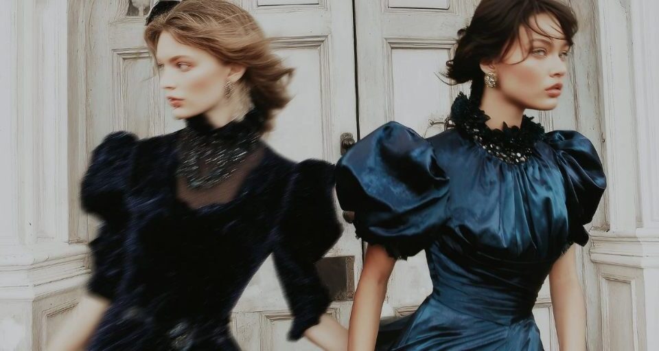
The Cool Winter realm is one of bold, bright, high-contrast hues. Think deep, rich, saturated shades like luxurious emerald greens and regal sapphire blues. These are colors that command attention, intense and dramatic, perfectly suited to accentuate the striking features and the high-contrast charm of the Cool Winter individual.
Key characteristics of cool winters include:
- Ideal Colors: Deeply cool, moderately saturated hues like navy blue, emerald green, bright white, shades of gray, silver, ice blue, and cold pink.
- Skin Color: Pale or light skin with bluish or pink undertones
- Eye Color: Intense, crisp eyes in cool tones, such as blues, grays, or cool greens
- Hair: black, ash blonde, black, or cool brown
Cool Summers Are More Subtle Than Cool Winters
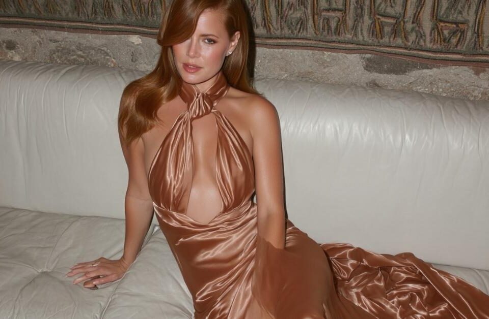
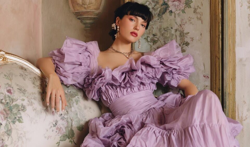
On the other hand, Cool Summer colors are the epitome of subtle chic. Think soft lavenders, misty blues, and pale greens – hues that are muted, toned down, and properly understated. These colors have a cool undertone, but provide a gentle coolness that blends in, rather than overwhelms.
Key characteristics of cool summers include:
- Ideal Colors: Medium in chroma, cool, muted shades that are low in saturation, such as mint green, rose beige, cool browns, soft white, grey, and most shades of blue
- Skin Color: Cool skin with blue, beige, and rarely, pink undertones
- Eye Color: Colored yet less saturated eyes in blue, light grey, grey, green, and grey hazel shades
- Hair: Ashy and muted brown, dark brown, ashy blonde, dark blonde, with low-contrast hues
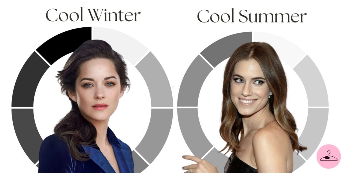
Cool Winter VS Cool Summer: Contrast Levels
Cool Winter and Cool Summer seasons are also distinguished by the level of contrast they can handle. The former, with their bright dazzling coloring of jewel-toned eyes, dark hair, and porcelain skin, can really shine in black. The high contrast of black against the Cool Winter coloring creates a radiant, vibrant effect, as black accentuates this color season’s overall clarity.
To illustrate, for cool winter celebrities like Marion Cotillard, black is very flattering, and so are heavier, grey hues. The color matches the strength of Marion’s high-pitched contrast, bringing out her striking features in a dynamic way. Most importantly, it brings attention to the contrast between her clear eyes, light skin, and darker hair.
Cool summers like Emily Blunt, on the other hand, have a lighter, softer coloring with greyish-blue eyes, ashy brown hair, and cool beige skin tones. For this reason, they lose their charm in black, as it washes out their lower-contrast coloring, causing them to lose some definition in their facial features.
Cool Summer VS Cool Winter: The Ideal Palette
The quest towards the most flattering color palettes is a delicate matter, as it should take into consideration each individual’s unique color and characteristics. When it comes to Cool Winters, the color season dominates the realm of cool, clear, and saturated hues that give off high contrast. This includes jewel-toned hues, such as turquoise, deep purple, and fuchsia.
Stark black and crisp white form the foundational pillars of the Cool Winter palette, in tandem with purplish indigo twilight, deep pine green, and the luminous bluey silver. These colors, entirely devoid of warmth, accentuate the clarity and coolness that defines the Cool Winter’s radiant allure, enhancing their striking complexion.z
In contrast, the Cool Summer’s essence demands a softer, more delicate approach. Their greyish-blue eyes, ashy brown hair, and cool-toned skin necessitates a palette of muted cool toned pastels and gentle neutrals. This encompasses soft pinks, blues, pastel greens, and cool beiges, which complement their beauty with understated refinement, devoid of harsh contrast.
Final Thoughts
While Cool Winter and Cool Summer share a cool undertone, they are worlds apart in terms of their contrast levels, color saturation, and overall aesthetic. Cool Winters favor bold, deeply saturated jewel tones, while Cool Summers require a muted palette of gentle hues. Ultimately, embracing the colors that best flatter one’s unique complexion is key, and this is achieved by observing your personal contrast level, undertones, and ideal palette.

Frequently Asked Questions
Cool Summers lean softer and more muted, with lower contrast and a gentle, misty quality to their coloring. Cool Winters have clearer, higher contrast features and suit vivid, icy cool tones. Testing silver vs. gold, plus draping soft vs. crisp cool shades, usually clarifies your season.
Cool Summers do best with soft, cool, slightly muted tones. Think rose, mauve, cool pink, soft berry, and blue-based pinks. Eyeshadows in dusty plums, soft grays, and misty blues support their gentle contrast. These cooler, low-chroma shades harmonize with their soft, cool palette.
Cool Winters shine in clear, bold, icy tones, such as cool reds, vibrant berries, fuchsia pinks, icy plums, deep purples, and crisp charcoals. Their high contrast and cool undertones pair best with saturated, blue-based hues that stay bright rather than muted, enhancing their sharp clarity.
Cool Summers benefit from soft, cool basics like dusty navy, soft gray, muted plum, and misty blue. Fluid fabrics and gentle, blended colors suit their low contrast well. These understated tones create a watercolor effect that enhances their naturally cool, muted appearance without overwhelming their features.
Cool Winters look best in crisp, high-contrast essentials – true black, bright white, cobalt, emerald, and magenta. Structured silhouettes and smooth, polished textures mirror their vivid coloring. Prioritizing clear, cool hues helps maintain the season’s signature sharp, icy clarity and keeps their natural contrast looking intentional.