

Light Spring Capsule Wardrobe: How to Style the Palette
October 27, 2025
Soft Autumn Purples: What Shades Make You Glow
October 31, 2025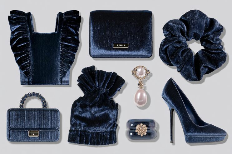
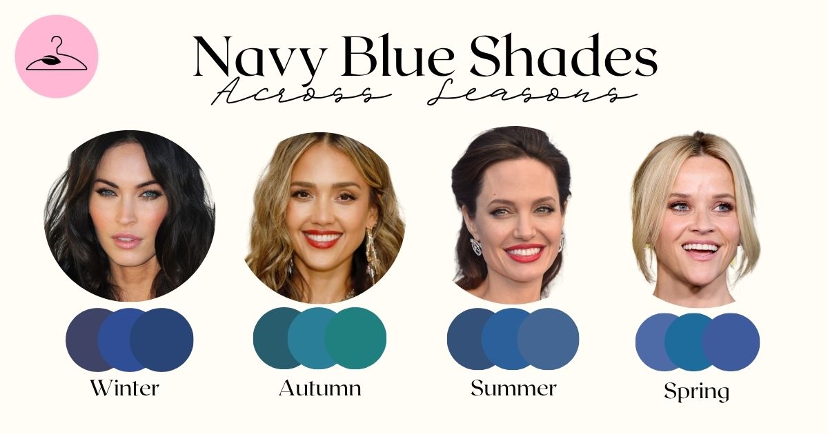
You’ve probably noticed how some blues make you look radiant while others leave you washed out. That’s not just your imagination: it’s color temperature at work. For many, this shows up the most often with navy, a timeless shade that doesn’t flatter everyone equally. Below, we’ll show which color seasons wear it best, how to tweak its tone or texture, and what to choose instead if it misses the mark.
What Color Season Is Navy Blue?
Classic navy blue, which is deep, cool, and saturated, belongs primarily to the Winter family. According to Color Me Beautiful by Carole Jackson, Winter types shine in clear, cool, and vivid shades such as royal blue, emerald, and icy tones. Navy fits naturally here, balancing Winter’s high contrast and crisp undertones.
That said, several other seasons have their own versions of navy:
- Soft Summer: prefers dusty navy or powder navy — a muted, gray-blue with cool undertones.
- Deep Autumn: wears warm navy with a touch of brown or green base (sometimes called “ink navy”).
- Cool Winter: thrives on the true, inky navy that pairs effortlessly with magenta, icy pink, or emerald.
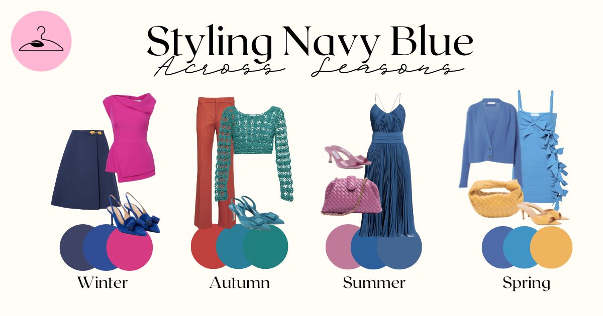
Navy Blue Across the Four Seasons
Winter Palettes
Winters (Cool, True, and Deep) handle navy best when it’s saturated, almost black. It complements their cool undertones and natural contrast. Combine with white, magenta, or emerald for a classic, high-impact look. Avoid muted or yellowed blues — they’ll dull your brilliance.
Autumn Palettes
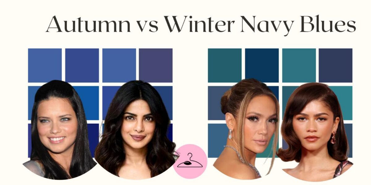
Autumns suit navy only with warmth, such as a teal-based or green-cast navy. Deep Autumn especially can use navy as a neutral alongside rust or camel. True Autumns, however, may find the classic cool navy slightly harsh.
PRO Tip: As an Autumn, you should generally avoid regular navy and opt for teal or warm navy substitutes.
Spring Palettes
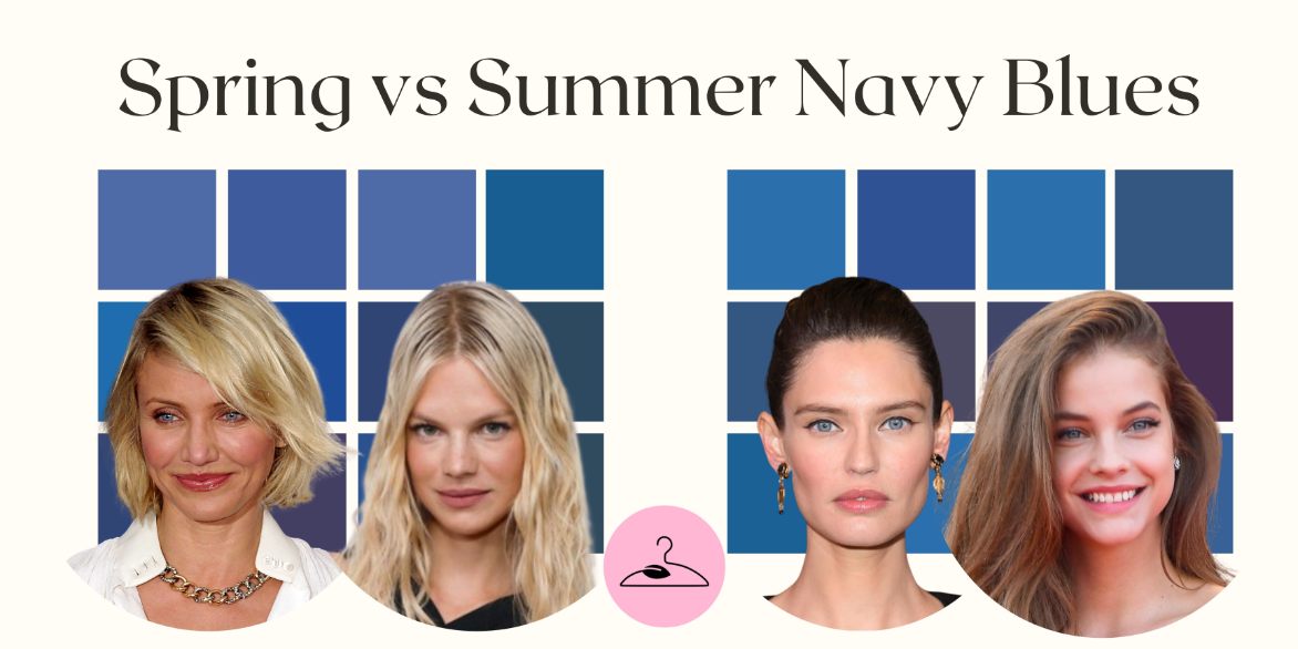
Spring can wear light navy, described as “clear and bright”, but dark navy is harsh and aging for this season. Light or Bright Spring types can substitute denim blue or warm cornflower, which harmonize better with their lively, golden warmth.
Summer Palettes
The Summer color family is cool-toned, so it incorporates some navy. However, it should be softened. Think of dusty navy, French blue, or slate blue, which are gentle tones with gray undertones that echo Summer’s cool softness. Avoid stark, inky navy, as it overpowers your look.
How to Style Navy Blue by Season
| Season | Best Navy Tone | Pairing Colors | Avoid |
|---|---|---|---|
| Cool Winter | Inky navy | Icy pink, pure white, emerald | Warm browns, beige |
| True Summer | Dusty navy | Soft rose, silver, heather gray | Black, mustard |
| Deep Autumn | Warm navy | Rust, olive, gold | Icy blue, lavender |
| Light Spring | Muted denim | Butter yellow, coral | Deep navy, black |
Navy Blue Pairings for Each Seasonal Palette
Navy is one of the most flexible neutrals, as it adapts beautifully to every palette when matched with the right tones.
If You’re a Winter: Pair classic navy with crisp white, icy pink, fuchsia, emerald, or cobalt. These cool, clear colors echo Winter’s contrast and brightness. Stick to silver or gunmetal details for polish.
If You’re a Summer: Choose softened navy — more slate than midnight — and pair with dusty rose, lavender, powder blue, or soft gray. Cool, misty combinations keep harmony with Summer’s gentle undertone.
If You’re a Autumn: Warm the navy with earthy companions like rust, camel, mustard, or olive. Cream and textured fabrics (tweed, suede, knit) enhance Autumn’s rich, muted depth.
If You’re a Spring: Keep navy fresh and lively with coral, peach, aqua, or butter yellow. Add light neutrals like ivory or warm beige and gold jewelry to reflect Spring’s sunny clarity.
Conclusion
Navy blue is a wardrobe essential, but the right navy makes all the difference. Seasonal analysis shows that Winters shine in deep, cool versions, Summers in dusty gray-blues, Autumns in rich warm navies, and Springs in light denim alternatives.
This becomes especially meaningful when you’re building a palette for your wardrobe. Once the tone aligns with your season, navy shifts from “safe” to striking. From there, choosing colors that mix, layer, and repeat becomes effortless. Each piece reflects your natural undertones, creating quiet harmony. When your palette works together, even a small wardrobe feels expansive, cohesive, and unmistakably you.

Frequently Asked Questions
Classic navy is cool, which is why it flatters Winter and Summer types. However, warm navies (those with subtle green or brown undertones) complement Autumn palettes beautifully. The undertone determines compatibility: crisp equals cool, earthy equals warm. Identifying this difference keeps navy from overwhelming your natural coloring.
Yes, particularly Deep Autumns. They look best in warm, brown- or olive-based navy that feels rich and grounded. Pair with camel, rust, or mustard for cohesion. Avoid icy or midnight navies that flatten warmth and contrast too sharply against Autumn’s golden, low-to-medium-value features.
Summers shine in softened, gray-tinted navies—often called dusty navy or French blue. These have cool undertones but low saturation, matching Summer’s muted aesthetic. Combined with rose, mauve, or pewter, this version of navy adds sophistication without overpowering the season’s naturally delicate coolness and harmony.
Hold the fabric near your face in daylight. If your eyes look clearer and your skin evens out, it’s right. If shadows appear, it’s wrong. Cool undertones need crisp, blue-based navy; warm complexions prefer softened navies with an olive, brown, or golden cast.
Yes, but only in lighter or warmer variations. Light and Bright Springs should opt for marine, denim, or warm cornflower blue. Pairing with coral, peach, or aqua helps lift the look. Heavy, inky navy contrasts too sharply with Spring’s gentle warmth and radiance.
Often, yes. Navy is refined but softer on most skin tones than black. Winters can treat deep navy as their signature neutral, while Autumns should prefer warmer, brown-based versions. Its adaptability makes it a staple for both structured officewear and relaxed capsule collections.
Summers glow in dusty, gray-tinted navy that mirrors their cool softness. Winters need inky or midnight navy – deep, high-contrast tones that enhance clarity. Both palettes should avoid warm, muted navies. The difference lies in saturation: Summers stay gentle; Winters embrace drama and crisp, jewel-toned pairings.
Spring palettes thrive on lightness and warmth, so replace navy with soft alternatives like warm denim, cornflower, or light camel. These hues preserve brightness and harmony. For structure, try cream, golden beige, or tan, as these are neutrals that echo Spring’s sunny undertone without losing its playful freshness.