

True Autumn Clothes: How to Style the Palette
March 24, 2026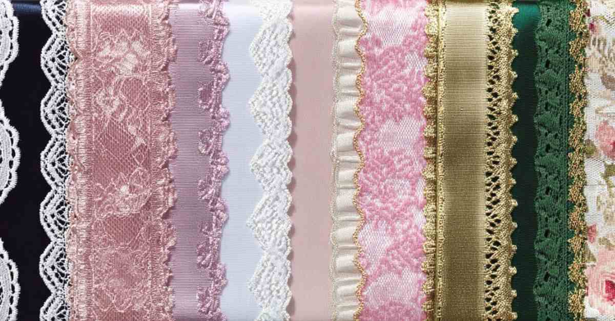
Every season, a fashion editor declares a new universally flattering color — burgundy, cobalt, millennial pink. It lands on every runway and every “what to wear” listicle. And yet it never looks quite the same on everyone. That’s color analysis at work: the practice of identifying which colors harmonize with your undertone, contrast level, and natural coloring, and which ones fight against it. Once you understand it, the idea of a single universally flattering color unravels fast. But something more useful takes its place.
Do Universally Flattering Colors Exist?
Unfortunately, there’s no single exact color that works for everyone. However, certain color categories are flexible enough to span multiple color seasons — provided you choose the right version of that color for your undertone (cool, neutral, or warm). Think of these colors as universally adaptable rather than universally flattering.
If there’s no universally flattering color – what’s yours?
1. Neutrals for Every Color Season
Neutrals are the wardrobe backbone for good reason: they’re versatile, timeless, and easy to build around. But the version of that neutral makes all the difference.
Beige: warm vs cool
Beige reads as “safe” — but on the wrong undertone, it can look muddy, sallow, or flat. The key is temperature: those with a warm undertone need beiges with golden or amber undertones, while cool-toned individuals need beiges that lean grey or rose.
Navy: warm vs cool
In color analysis, navy spans multiple color seasons, as it is a color family that spans from warm, slightly greenish tones to pure cool blue-black. However, true navy, as we know it, belongs primarily to the Winter family, that is, individuals with higher contrast and a cool undertone. Here’s what it looks like across different seasons:
White: warm vs cool
White is the neutral most people assume is universal, and it’s actually one of the trickiest. Stark white can age cool-toned seasons and wash out warm ones; the wrong white near your face is more unflattering than almost any color mistake. Here’s what actually works for each season:
2. Mid-Intensity Colors
If neutrals are the foundation, mid-intensity colors are where things get interesting. These are colors that sit in the middle of the saturation and brightness spectrum. They have enough presence to be intentional, but not so much that they overwhelm softer complexions or clash with muted ones. They’re the most cross-seasonal color family that exists, however, with one condition: you still need to dial the temperature to your undertone.
Three families stand out as especially adaptable: teal, rose, and green.
Teal: warm vs cool
Teal is one of the most adaptable mid-tones in color analysis. It lives at the intersection of blue and green: it has both a warm and a cool expression, where neither dominates. That balance is what gives it cross-seasonal range. But it’s not a free pass: your teal color season still determines which version actually flatters you. For example, cool-undertoned summers and winters gravitate toward blue-leaning teal, while springs and autumns come alive in the warmer, yellow-green versions. The teal family is forgiving, but the temperature still has to be right.
Green: cool vs warm
Rose: cool vs warm
3. Bridge Colors: The “Safe” Middle Ground
Bridge colors sit at the intersection of warm and cool, soft and saturated. They don’t belong firmly to any season, which makes them the most genuinely flexible shades in color analysis — but “flexible” doesn’t mean “flattering on everyone equally.” Think of them as colors with a wide margin for error rather than a guarantee. They’re a smart choice when you’re dressing for a group, shopping without your palette, or just want something low-risk.
What Colors to Avoid Across Seasons
Color analysis explains why certain colors work and others don’t, and the latter almost always comes down to one thing: wearing the extreme opposite of your natural palette near your face.
The closer a color is to your face, the more directly it interacts with your skin tone, the whites of your eyes, and your natural lip color. A wrong color in that zone doesn’t just look “off.” it can make you appear tired, washed out, sallow, or older than you are. The same color worn as trousers or shoes has a fraction of that impact. This is why color analysis focuses so heavily on what you wear at the neckline, and why getting that right matters more than any other styling decision.
Frequently Asked Questions
Warm skin tones need purples that carry red or golden influence rather than blue. Plum, aubergine, reddish violet, and warm berry all sit close enough to the warm side of the spectrum to harmonize with golden undertones rather than clash with them. They read rich, deep, and intentional. Icy lilac, pale lavender, and blue-violet sit too far on the cool end and tend to make warm complexions look sallow or uneven.
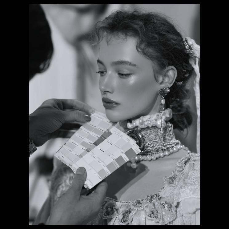
Universal colors work when their undertone (or temperature) matches yours. The easiest way to test this is to hold warm and cool versions of the same color near your face in natural light. Your best version will make your skin look clearer, more even, and awake. The wrong one will cast shadow, emphasize redness, or make your complexion look dull and flat.
Navy has a unique advantage over most colors: it exists in both cool and warm variations, which means almost every season has a version that works for them. It’s also considerably softer than black, making it far less likely to drain or overpower natural coloring. Worn in the right temperature, it enhances your features rather than competing with them, which is why it feels like a universal, even when it isn’t quite.
Red is one of the most undertone-sensitive colors in existence, which is why it looks electric on some people and wrong on others. The rule is simple: blue-reds and cool crimsons for cool skin tones, orange-reds and tomato reds for warm ones. The right red will make your complexion look bright and your features sharp and defined. The wrong one will read harsh, sallow, or simply off in a way that’s hard to ignore.
Black is often treated as the ultimate neutral: slimming, chic, and safe for everyone. In color analysis, the reality is more nuanced. Black is flattering for Winters due to their high contrast and cool undertone. For Springs and Summers, black worn near the face can look harsh, aging, and draining. If black isn’t in your season’s palette, the fix isn’t to avoid dark colors entirely, but to find your version of dark: deep navy, charcoal, chocolate brown, or soft black with a warm or muted base.