
Soft Autumn Eyes: Best Colors, Makeup Tips, and Styling Advice
August 29, 2025
True Autumn Makeup: What Really Makes You Glow
September 12, 2025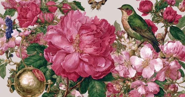
Light, bright, and impossible to ignore — Bright Spring is where clarity meets warmth in color analysis. This palette thrives on high-energy hues like coral, aqua, and sunny yellow, all with a playful yet polished edge. In this guide, we’ll explore the Bright Spring color palette, how to wear it, pair it, and make it your own. Let’s dive right into it.
Bright Spring Color Palette: floral, light and playful
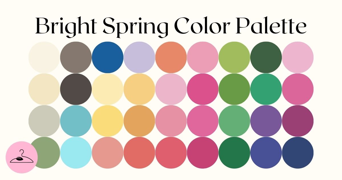
In 16‑season analysis, Bright Spring sits between Bright Winter and True Spring, so it blends winter’s clarity with spring’s warmth. The dominant qualities are clear, bright, and warm‑leaning: never muted or dusty. Core hues include:
- Soft yellow – lemon, sunshine and pastel type
- Floral pink – rose, fuchsia and magenta
- Natural green – grass, shamrock and bright leaf green
- True red – crisp, vibrant, and rich reds
- Contrasting ‘deep-sea’ – dark navy blue and seaweed green
- Neutrals: warm ivory, cream, light camel, warm beige, navy
As you can see above, this palette is devoid of muted or dusty tones. Instead, it prioritizes high contrast, vibrance, and luminosity, making it ideal for individuals with high-contrast features.
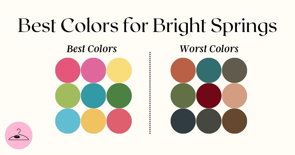
Best vs Worst Colors for Bright Springs
Bright Springs shine in clear, warm, and highly saturated hues that reflect their fresh and energetic coloring. These include:
- Neutrals: Warm ivory, light camel, cream, warm beige, and bright navy.
- Reds: Bright coral, watermelon red and geranium
- Pinks: Flamingo pink and cool bubblegum pink
- Blues: Clear aqua, warm sky blue, turquoise, and light cobalt.
- Yellows: Daffodil yellow, vibrant lemon, and light sunflower yellow.
- Other Bright Tones: Bright peach, apricot, tangerine, coral pink, and metallics like light gold or warm rose gold.


❌ Bright Spring Colors to Avoid
When it comes to the worst shades for Bright Springs, muted, cool, or overly dark tones are the biggest culprits. These colors clash with the palette’s vibrant and warm essence and can leave the complexion looking dull or washed out.
- Dark, Heavy Colors:
Black, charcoal, deep navy, burgundy, maroon, and eggplant are too heavy and overpowering for Bright Spring’s vibrant coloring. - Muted or Dusty Shades:
Brick red, dusty rose, mauve, sage, olive, moss green, and lavender grey lack the clarity and brightness needed for this season. - Cool, Blue-Based Tones:
Steel blue, cool mint, icy baby blue, and some jewel tones can feel too cold and clash with Bright Spring’s warm undertone.
- Earthy or Brown-Tinged Colors:
Mustard, ochre, muted gold, and taupe-based beiges feel too soft and grounded, muting the season’s crisp energy. - Harsh Neutrals and Icy Metallics:
Pure white, black, icy grey, gunmetal, and silver lack warmth or softness — opt for warm ivory, light camel, or gold-toned neutrals instead.
PRO Tip: Overly soft pastels, such as powder blue and pale lilac, can sometimes appear too gentle for Bright Spring and risk washing out its high-energy vibrance. Hence, we recommend balancing them out with stronger shades in your outfits.
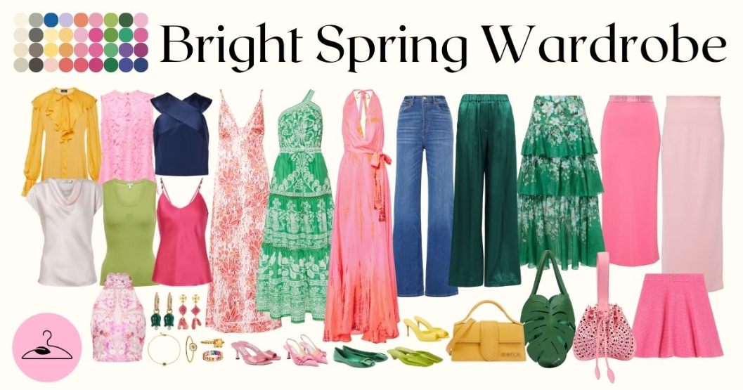
Bright Spring Capsule Wardrobe
A Bright Spring capsule wardrobe brims with warm, vibrant hues that feel fresh and playful. Think polished basics you can mix and match, with each piece adding a lively spark that instantly lifts your mood. Here are your key pieces:
- Tops (8) – Vibrant picks like a mustard blouse, hot pink and lime tanks, a navy crop top, soft florals, and satin-finish tops in blush and white.
- Dresses (4) – Statement styles in green prints, coral patterns, and a standout pink ombré maxi.
- Bottoms (6) – Blue and dark denim, green wide-leg pants, and tiered or sleek skirts in fuchsia, blush, and floral green.
- Shoes (6) – Fun heels in pink, green, yellow, and lime to mix and match with ease.
- Accessories – Colorful earrings, rings, and bags in green, yellow, and pink to add personality.
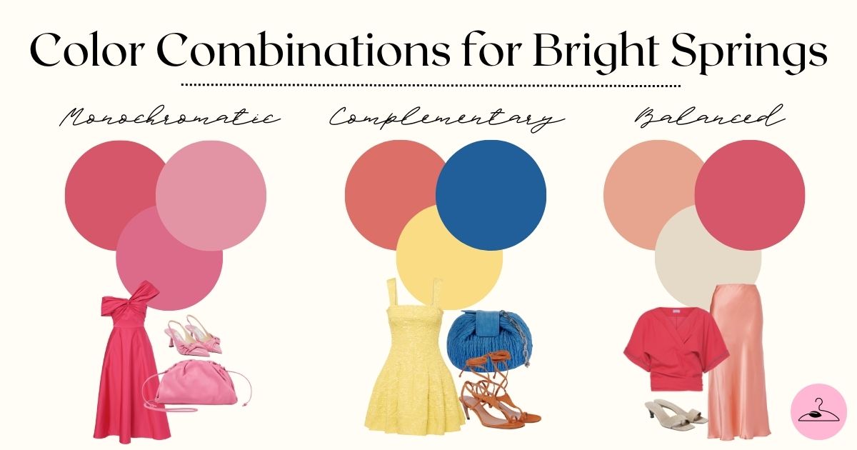
Color Combinations for Bright Springs
As you start exploring Bright Spring Wardrobe, you will be able to create chic-style outfits without relying on black, grey, mauve, or icy blue shades. Here’s how to play with color and keep your looks fresh and seasonally aligned:
- A Monochromatic Look: Style different hues of pinks such as watermelon, salmon and bubblegum pink.
- Complementary Look: Pair a lemon yellow short dress with a small blue jute bag and nude shade sandals.
- Balanced Look: Try pairing a peach satin skirt with a coral top and beige heels. It’s refined yet colorful — ideal for a polished daytime look.
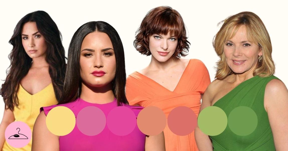
Bright Spring Celebrities: Winning Red Carpet Looks
Famous Bright Spring celebrity examples, such as Demi Lovato, Emily Rossum, and Heather Graham, typically have a neutral-warm undertone with skin carrying a warm golden or peachy glow. Their eyes sparkle with turquoise-blue, bright green, or light hazel hues.
However, what unites these celebrities the most is the way they look in vibrant colors. When dressed in coral, aqua, or daffodil yellow, their features light up and appear more energetic.


How to Follow Bright Spring Celebrity Looks
These celebrities perfectly embody the Bright Spring palette with their vibrant, high-energy red carpet looks. To bring their style into your own wardrobe:
✔️ Stick to warm, bright colors with clear and crisp quality.
✔️ Choose fabrics with light-reflecting qualities like satin, chiffon, or metallics.
✔️ Play with patterns and color blocking to add energy and movement.
✔️ Avoid wearing overly dull, cool, or deep colors near the face
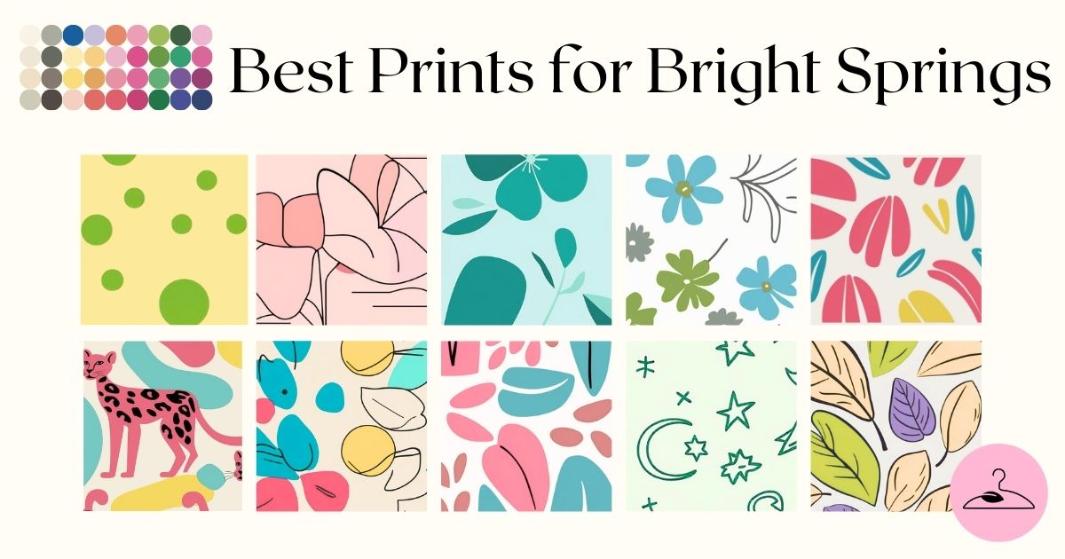
Best Prints for Bright Spring Color Palette
Now, let’s go ahead and decide on the appropriate prints for your palette. The key is to match the contrast and vibrancy that define Bright Spring.
Geometric prints with crisp lines and bold color combos — like vivid turquoise, coral, yellow, and grass green — are a great fit. Florals can work beautifully too, as long as they have clear edges and bright, warm tones (avoid watercolor or muted styles).
Polka dots and stripes in high-contrast pairings (think navy and white or bright green and yellow) add a fun, playful touch. Even animal prints can work, as long as they’re in clean, bright tones rather than soft, dusty ones.
PRO Tip: Go for prints with sharp definition, lively colors, and strong contrast to keep that signature Bright Spring clarity and energy.


Bright Spring on The Color Wheel
Bright Spring is one of the three Spring types, positioned between Bright Winter and Warm Spring on the seasonal flow chart.
Unlike Bright Winter, which has a cool undertone, Bright Spring is warm. Both are sister seasons — hybrids of Winter and Spring — though Bright Winter leans more toward Winter, while Bright Spring is closer to Spring.
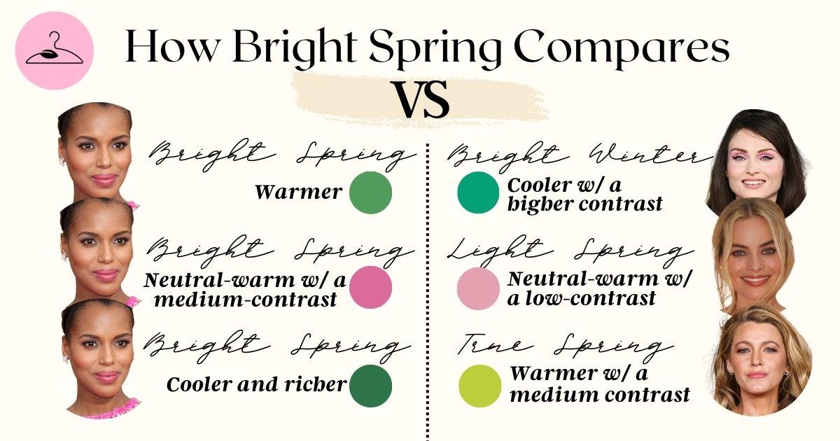
How Bright Spring Compares to its Sister Seasons
Bright Spring is one of three spring seasons and falls between Bright Winter and True Spring on the seasonal flow chart. However, still differentiates itself from its warmth and vibrant essence. Let’s see how Bright Spring is distinct from its sister palettes.
Bright Spring vs Bright Winter
Well, as we know, Bring is more lively, warmer and cheerier, but Bright Winter leans towards darker, crisper and cool tones such as Honeysuckle, Beetroot or Fuchsia.
Bright Spring vs Light Spring
These two color palettes might sound similar, but the key difference to be noted here is that Bright Spring colors are more intense and saturated, while Light Spring colors are softer and more pastel.
Bright Spring vs True Spring
Bright Spring colors are slightly darker, brighter and less warm than True Spring. Whereas, True Spring is purely warm and less contrasting.
All these palettes share seasonal qualities, but Bright Spring uniquely combines clarity and contrast with a warm-leaning temperature.
Final Thoughts: Embracing the Joy of Bright Spring 🌸
Now that we’ve explored the world of Bright Spring, it’s your turn to bring it to life! Here’s a quick recap to keep in mind:
- Choose clear, bright shades to highlight your natural glow.
- Avoid overly heavy, muted, or cool tones — they’ll dull your brightness.
- Experiment with playful prints, color blocking, and crisp contrasts for extra energy.
- Go for light-reflecting fabrics like satin, silk, and metallics to enhance your lively palette.
✨ Want more inspiration? My Eco Closet has a curated Pinterest board with Bright Spring color combos, celebrity looks, and easy outfit ideas to get you started. Let’s get you shining in those perfect hues!
Frequently Asked Questions
The Bright Spring palette features clear, warm, and highly saturated colors like lemon yellow, coral, aqua, and rose pink. It captures the vibrant, floral energy of spring with bold hues and crisp contrast — perfect for those with neutral-warm undertones and sparkling eye colors.
Bright Spring colors are more vivid, saturated, and slightly darker than the soft, pastel hues of Light Spring. Light Spring leans gently warm, while Bright Spring brings higher contrast and clarity, adding boldness to the wardrobe without feeling overpowering.
Bright Spring neutrals include cream, warm ivory, light camel, and warm beige, all of which complement the season’s vibrant hues. Avoid pure white and black, as their starkness can overpower the palette. These warm-toned neutrals create balanced, stylish combinations with brighter shades
Absolutely! Bright Spring thrives in bold geometric and floral prints with high contrast and well-defined lines. Look for vibrant patterns in turquoise, coral, yellow, and green, featuring crisp edges. Avoid muted or faded prints that lack clarity and definition.
Opt for light-reflecting fabrics like satin, chiffon, cotton blends, and warm-toned metallics, which add dimension and radiance to your wardrobe. These materials enhance the brightness and softness of your color palette, reflecting the playful, lively essence of the spring season.
To complement Bright Spring tones, opt for warm, clear shades like peachy blush, coral lipstick, golden highlighters, and bright turquoise or green eyeliners. These vibrant hues enhance your natural glow, while avoiding cool greys, mauves, and muted tones that can dull your complexion.
Black isn’t ideal for Bright Spring, since its depth and coolness can overshadow your natural clarity. If you must wear it, soften the effect by adding a vibrant Bright Spring scarf, jewelry, or lipstick. Pairing black with coral, aqua, or lemon helps keep your look lively and harmonious.